I’m excited to show you guys Jill’s flash-mob surprise makeover results! But I thought we’d start with a little chat about how we handled her room layout.
Let me just forewarn you that the furniture, rugs and finishes in these little layout sketches are all horrible and not at all representative of the design for her room. Before you proceed, you must swear to me that you understand that and that you will not judge any leopard print rugs you might encounter today. Check the box that you agree to these terms, please.
Here again is Jill’s living room, the before:

This is the layout before:

It’s a long, narrow room with four hundred doors, pass-throughs and windows to account for. I’ll walk you through our process for figuring out a space plan that made sense for Jill’s family, and if you’re working on a floor plan, hopefully it’ll help you settle on something functional too.
Start with function: analyze how you use the room
This is the room that Jill and her family use to entertain company, so we knew we needed a layout that facilitated easy conversation. They also use it as a reading room. And they own some books, like a billion, which we needed to store. Finally, they keep some toys and games in this room so storage for those things was a must as well.

This will be controversial, but if you use your living room primarily to watch television — this is a safe place and you can admit that — it’s okay to lay out your furniture for that purpose. The point of design is to create spaces that work for the way they’ll be used. However, if you’ll also be entertaining, you’ll have to work a little harder to create a dual-function layout that can support conversation, laughter and the playing of Taboo and Balderdash, or other board games of choice.
Not Chess or Risk though: no one wants to play that boring crap.
Create Zones
Especially in long, skinny rooms like Jill’s, sometimes you need to split the room into different zones. If you can’t sit in one part of the room and easily converse with someone sitting in another part of the room, it’s safe to say your room needs separate zones.
That’s what was going on in Jill’s living room. It was too long and narrow to create one conversation space:

So we needed to define one area – the conversation area – and use the rest of the room for a different purpose. Once you split the room and think of it as two separate spaces, it gets much easier. We essentially thought of these two zones as two different square rooms.

I think Jill’s living room would’ve been really nice with a table on the other half, since their kitchen is on the opposite side of that half-wall:

But functionally, they didn’t really need a table there, and we didn’t have time or budget to go find another one anyway, so we just went with a little reading area with the recliner that was already there. (The Husband requested that the recliner stay, and I was not going to be the one to take his recliner, yall. I’m not a monster.)

IGNORE THAT LEOPARD RUG. I’m using this floor planning software that only offers ugly rugs and furnishings. I’ve been backed into a corner.
Measure everything
Get the room’s full dimensions, obviously, and the placements of all the doors and windows, plus the dimensions of any furniture you’ll be keeping. I use floorplanner.com (and its ugly rug selection) to play with layouts, but ain’t no shame in going old-school: you can also just measure and cut things out with paper and play with the layout that way, like this:

And try anything
Get crazy and try weird layouts. Just move stuff around. Can’t hurt nuthin, yo. I recommend commenting to your husband how much you enjoy watching his muscles ripple while he moves the sofa for the sixth time. Decorating keeps marriages strong.
Create traffic flow
A good rule of thumb I use is that you need about three feet of walking space around the furniture. Plus you want an easy route for your wild children to run through the room. I mean for adults to slowly walk through.
Orient toward the focal point
What’s the focal point of the room? If it has a fireplace, bam: the decision is made for you. Nothing is worse than a room where the furniture is not oriented toward the fireplace.
The easy start for laying out a room is to orient your largest piece of furniture toward the focal point. You can start there and then play around with other arrangements if necessary. If we did that in Jill’s room, it would look like this:

Which is not a terrible starting place, but it’s not where we ended up.
If you don’t have a fireplace, your focal point might be architectural, like large windows or bookcases, or without something like that, you can create a focal point with large-scale art or mirrors, or even patterned curtains. Don’t be intimidated by deciding what’s the focal point of your room. It’s really just whatever you want people to see FIRST when they walk in. (But if you have a fireplace, it’s the fireplace. Kelly’s Rule.)
Try symmetry first.
If you can create a symmetrical layout, more times than not, it’s going to be the best option.

That doesn’t mean an asymmetrical layout can’t be awesome and perfect in your space! Just know why you’re doing it.
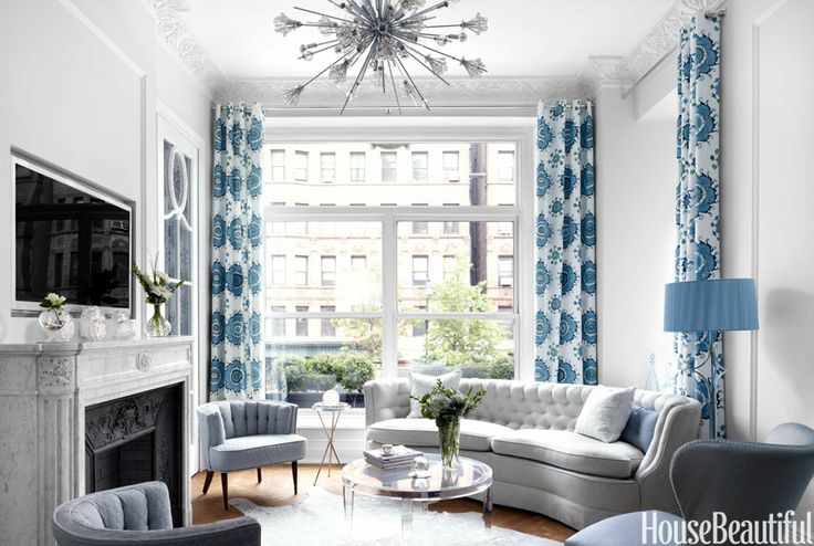
And if you’re not sure? Try symmetry first.
Go off the wall!
In most rooms, the layout looks better when the furniture isn’t all clumped up on the wall like 13-year-old Kelly at the junior high dance. Bring it out into the room and float it. Jill’s room, especially, would be super weird will all the furniture against the wall:

You’d break your neck trying to have a conversation with someone sitting on the other sofa – plus it would impede the traffic flow through the room – so we pulled some of it off the wall and floated it.
Jill’s Layout
We landed on this arrangement:

We used the pair of chairs to separate the zones and the rugs to define them, and we left the wall opposite the fireplace open for easy traffic flow. If we’d filled that space, say with a console table, you can see how it would’ve been harder to walk from one pass-through to another:

The reason why we went with this layout and not this one:

…is that we liked how when you walked into the room through the pass-through, you could walk right into the seating area and plop right down wit yo bad self.

With the first option – the sofa facing the fireplace – you would’ve walked right into the back of the sofa. Plus, it felt a lot more crammed with that option in real life than it looks in these pictures, for some reason. I guess you’ll have to take my word for it?

Orienting your largest piece of furniture toward the focal point is a great starting place, but it’s not necessarily always the best option. We considered the focal point (the fireplace) and the traffic flow and landed on this layout.
Here’s a quick recap:


- Measure your room and your furniture.
- Use paper that you’ve cut to scale or a floor planning software to play with different layouts.
- Analyze how you actually use the room, in real life and not fantasy world.
- Decide whether you’ll need different zones or just one.
- Define your focal point and orient the largest piece of furniture toward it to start with. Lay everything else out symmetrically, with the seating facing each other or floating off the wall, if it works in your space.
- Consider the flow of traffic through and into the room. Leave about 3 feet of walking space through the main pathways.
- Begin tweaking from there until it feels right to you. You’ll know you’ve hit on the right layout when it functions well for what you need and it just feels right.
Have you ever had to deal with a tough room layout? How would you have done this room? What’s your least favorite board game? (I hate Scrabble. Can I still be an American?)
P.S.: Check out the rest of the Decorating 101 posts right here!

 Hi, I'm Kelly. Glad you're here! This little blog is where I chronicle our efforts to fix up our beaten-down home on a tiny budget. We're not there yet, but here's a peek at the view along the way...






Awesome tips. I always try symmetrical first. I’m so drawn to it.
Oh, I love this post! I’ll be moving in a year or so and have an apartment for my own for the first time ever. This will be so helpful when I plan my rooms! It mostly worked what I did intuitive in my apartment now, but there are a few things that annoy me now, after a few years!
Thanks 🙂
Love, Midsommarflicka
Can we co-design a room using ONLY animal prints? AMAAAAZING. And I agree with positive reinforcement for the husbands. They’re more likely to help when you comment on their muscles.
YES, but only if we can stencil a large-scale zebra print all over the walls. I won’t compromise on this.
Awesome tips! I had this struggle with my living room– I got sort of locked in to how the furniture was set up when I toured the house so when we moved mine in I put it that way too, and there was all this big awkward space because everything was shoved against a wall. Floating the furniture is a solid game changer 🙂
You hate Scrabble!? I guess you can still be American since we’re supposed to be all inclusive and stuff but, gosh. No scrabble?
I have just the opposite problem in the Little House… there is only one way for furniture to be arranged in each room. Period.
Love the room… well the plan… wanna be MY friend? My livingroom needs a little arranging/styling help but I’m not sure how to work with the huge window, off center built-ins, and TV (which for the time being has no other home).
I hate monopoly. I tell my husband it’s the biggest waste of 10 years of your life EACH GAME! Haha. I seriously haven’t played it many times and not for a very long time but…
You have a knack of showing stuff in a way I can grasp the meaning. Thank you! Or maybe it was the animal print rug. Can’t wait to see the final look!
Long rooms with odd layouts always are a design challenge. Our living room back home is like this and floating the furniture really made the difference. Great ideas Kelly 🙂
Yet contractors continue to build them that way! Aarrgh!
Agh! I need your help with my new house! The living room is kind of long like this room. It has a fireplace, only one spot for the TV and the front door. The kitchen also looks into the living room. I have a couch and love seat (that are super ugly, but they’re all we have ATM) and I’d like to find some toy storage somewhere. I’m at a total loss, but this post might just help me!
The layout (and the thought and thoughtfulness behind the project) is amazing! Can’t wait to see the finished product
Our living room is actually laid out exactly like this, as essentially two rooms, but we have two swivel chairs in the center—-one of them is a recliner—- and two recliners instead of one on the one wall (yes, we have three recliners in our living room. And our coffee table is actually an ottoman. I like putting my feet up on the furniture! Deal with it.). That way we have two separate conversation groups, and the people in the center can join the conversation in whichever direction suits them at the moment. I’m sure it wasn’t possible in your time frame/budget, but for other people looking at this, is is sometimes possible to add a swivel base to existing chairs or to your recliner, which makes additional layouts possible. Just sayin’
Great idea to use swivel chairs there!
I think the layout you chose is perfect! Can’t wait to see the rest of the makeover.
I think Sorry! would have to be my least favorite board game. I love Boggle but no one likes playing with me because I kinda rock…
I will play you in Boggle. No one will play me either!
Awesome!!! Looking forward to it 🙂
Great tips- pinning for when we finally re-arrange!
Taboo, Cranium, several card games including Nertz. 🙂
I have had several challenging living rooms in my short married life. In our current house, my craft room/the guest room was super challenging because it had to serve two purposes and there are only two outlets in the room. My challenges usually come from having several pieces of antiquee and heirloom furniture that I cannot just say “oh it doesn’t fit, sell it and replace it!” And I wouldn’t want to say that even if I could! My living room now is long and skinny and most of the furniture in there is pushed against the walls but I did the best I could and in the end it turned out pretty good. Although if I could find a rug I liked for a price I liked it’s be better.
Nooo, even Nertz?!!
Wait, did I miss it? Is there an “after” picture of Jill’s living room? I saw the before pic. On pins and needles over here ;)!!
Sorry, it’s coming! 🙂
Room layouts can be so tricky!! Love these little tips. Layout is probably the most important thing and thing that gets the least thought.
We had a long skinny living room like that at our old house….it was very tricky! I guess a reading corner is nice, too, but I kind of wish you would have left that as a mystery zone….like painted black with giant silver question marks on the walls. and maybe a….disco ball? why not? so mysterious!
Oh MAN! Major missed opportunity!
Lol. That reminds me of a room I saw while looking for houses as few years ago. I think it was once a dining room, but it had, I kid you not—dark brown faux fur on the walls and ceiling. Talk about a mystery zone!
It makes logical sense to use the fireplace as the focal point, but what if you hate your fireplace? I’m choosing to ignore my fireplace (until we can get around to making it over) and use the tv stand next to it as my focal point.
If you don’t love it, I’d say don’t focus on it!
I think we need to be best friends. Your “bad board games” are the same as mine. And also Monopoly. Every game of Monopoly I’ve ever played has ended with someone tossing the board. (Not always me).
And also because I love your blog!
YES to monopoly! It divides families! 🙂
Hey, quit those snide comments about leopard rugs. They are AWESOME (speaking as one who has a leopard print rug in her “library” (TV room to the real world). Leopard print rugs are classic and timeless and declare I’m a woman of good taste…. or so I claim.
Loved the post and tutorial about space planning.
Okay, I totally hear you — but that one, with the border, is NOT classic and timeless. It *can* be awesome, but in this specific case, was decidedly not. 🙂
Kelly, I haven’t even finished reading the post, and had to comment on this little gem: “Not Chess or Risk though: no one wants to play that boring crap.” HAHAHA!!! I love design, and floor plans are like… something people really love to look at, but I can’t think of what the word is. Fine art? Anyway, I love that I can visit your blog and see all the stuff I love to look at AND be highly entertained at the same time. 🙂
<3 <3 OMG, I couldn't agree more about floor plans being like fine art. Do they make art galleries with just a bunch of floor plans? They could even do whole-house architecture plans and I'd be fascinated! We could go there. Girls night.
Thanks for the insight into your thinking process! Fascinating!
Dude, I freaking LOVE measuring rooms/furniture and moving little cutouts around on carefully marked-off graph paper. Like, you have no idea. My husband tried to hook me on software and I was like, “NO! Graph paper is prettier.”
This is such a great post–my current living room really only has one place to put the couch so there isn’t much you can do with it, but our new house has a combined living/family, which is huge and L-shaped and I’m at a total loss what to do about it. I think it might need to be 3 zones, but now I can’t figure out how to split up the 3 zones…
Alls I can say, it that this was so worth coming back from vacation for!! 😀
Impressed! Sometimes a right option stays closer than you´ve thought. I mean find symmetry between all my stuff :/
Very sweet. I ended up with a similar layout in my small living room with three doors and two windows that is 50% traffic flow lanes.
Great tips! I’m guilty for putting furniture against walls! Will definitely take your advice in our new living room layout (with slightly more space)! Thanks for sharing! 🙂
I love this post and your ideas…but I’d love your opinion on my family room dilemma! This is the room where we watch tv and also sit to visit when we have company. However I feel there are two focal points..one is a large built in book case with a television space in the dead center. The layout is symmetrical and the wall is about 20 feet. There is a fireplace on the wall perpendicular to the bookcase, centered between 2 large French doors. Do you have any thoughts on this?
Thanks! Your room actually sounds very similar to mine – we have a bookcase/TV on one wall and a fireplace on the other. You can see how we laid ours out in this post: http://viewalongway.wpengine.com/2014/06/new-rug-call-truce-andys-feet/. We just placed the furniture so both focal points are included.
Solid wisdom!!
Great post! I’m curious about what floor planning software you use, I’d love to try it!
this is great. I love that you can acknowledge that different people use rooms differently. Some designer rooms I look at and can’t picture real life there!
I love your ideas, especially the playful commentary!!! Great stuff!
Love the transformation!!!
What’s the name of the software you used to help design the room?
Thanks! I just used floorplanner.com.
Fantastic room makeover! I have the weirdest living/family room. I want the fireplace to be a focal point but it’s shoved in the corner with a brick hearth jutting off to one side. Total nightmare placing furniture in this room. I’m gonna try messing around on the website and see if I can come up with a solution. After four years of trying, I could use a solution!
I’m late to this blog but am pinning this for the great tips! Thanks Kelly!
Great post! Just discovered this on Pinterest. I have a long narrow living room. Hate it but I had to create zones just like you said and I always go for symmetrical. It appeals to my OCD nature. Also have to say love that you used Taboo and Balderdash as game examples. Two of my faves!
Good article!
You should check out the iPad/iPhone app called Room Planner it lets you do the space planning, but also take camera views of the room, and choose paint colors, move furniture, etc. It really helped me to plan my living room layout! http://roomplanner.chiefarchitect.com/
This is great! I have a room much like this with 3 windows, 4 doors and a pass-through … Not to mention the odd-placed heat registers :\
I have a long, narrow living room you would love to hate. No matter the orientation of furniture, movement in, through, around is blocked in some way. If only I could move the front door! (And no. That is not an option.)
tips are very good, I hope to be an inspiration for people who want to get a beautiful room, like living room,dinning room and family room..thanks for sharing..
Kelly,
What if you BOTH a fireplace and a TV in different walls??? Which should be your focal point? I love our fireplace but we also use that room to watch TV a LOT!
That’s exactly how our living room is too! We have a dual-focal-point situation. 🙂
SO, I know I’m totally a year late on this, but I just had to comment. Not only do I appreciate the tips/tricks you’ve posted here (and you disdain for Risk), but your writing style is like the voice in my head (and most of the time the voice out of my mouth, as well). And to find this help, in this voice, at this time, is all kinds of fate. My husband and I just bought our first home about 7 months ago and we’re finally to the point now where we’re used to how we’re REALLY using the spaces and planning out how to move/buy furniture to better utilize them (and make them purdy and stuff 😉 ). Just a side note, when we moved into our first apartment, my husband (an engineer) used AutoCad to create scale models of our layout and all of our furniture so I could play around with it. He knew I’d never be able to get it perfect enough using graph paper/scissors and I didn’t want to go digital. He TOTALLY gets me 😉
Awesome tips! Spacing furniture out too far can cause an issue, its best to keep things close in distance to create conversation space. Thanks for sharing!
Did I miss something? Is there no AFTER picture?
Hallo there from Belgium,
Great job with this analysis of the space, needs and possibilities and even greater on teaching how to do that/communication. You are my star! Will certainly learn from you and thank you for sharing.
Agi
Just wondering where the “after” picture is? Great ideas, etc., but a little disappointed that there was no visual besides a drawing. (There was a “before”.) Regardless, I do enjoy your ideas and writing, but just had to ask.
i hope that man can still see the TV from his recliner at minimum. And honestly while it looks good. If he sits in his favorite chair he is not sitting with his wife or family. Personally I’d want the recliner in the seating group or to compromise on the chair choices or a reclining sofa together with my husband. Takes a lot to mess with a man’s recliner but I think it’s a bad deal to stick it in isolation also.
Great tips! Thank you so much for sharing! I sure do wish we had played around with the furniture layout while we were designing our house.
Creating a layout plan often helps you to decorate or style rooms more effectively. Thanks for posting.
Thanks for these decoration ideas, were very helpful to me.
Thank you for posting all of the layout options and why they didn’t work as it is helpful! I’m curious of your ideas about open layouts and asymmetrical rooms. I am second guessing my ideas.